Jack Kirby’s Fantastic Four Artist’s Edition (IDW/Marvel)

jack-kirby-ff

CREDIT: IDW / Marvel Comics

Rating: 5/5 – Another Masterful Presentation of Original Comics Artwork
by ComicSpectrum EiC Bob Bretall

I’m a long time fan of the IDW Artist’s Editions.  Series Editor Scott Dunbier is, in my opinion, no less than the patron saint of original comics art preservation.  He uses his connections to beg and borrow these precious artifacts so they can be scanned at high resolution and presented to fans of comics in these massive tomes.

The color scans show the original art at its original size warts and all (in this case approximately 11″ x 17″).  But I love seeing the age, the white out, the paste ups, and the margin notes.  These are not books to be bought simply as a collected edition to read the original stories, though I love that you can also do that.  These allow fans of the comics art form to pore over the pages and feel the energy in the black and white art as created by the masterful Jack Kirby  and inked by Joe Sinnott.

ff83-oa

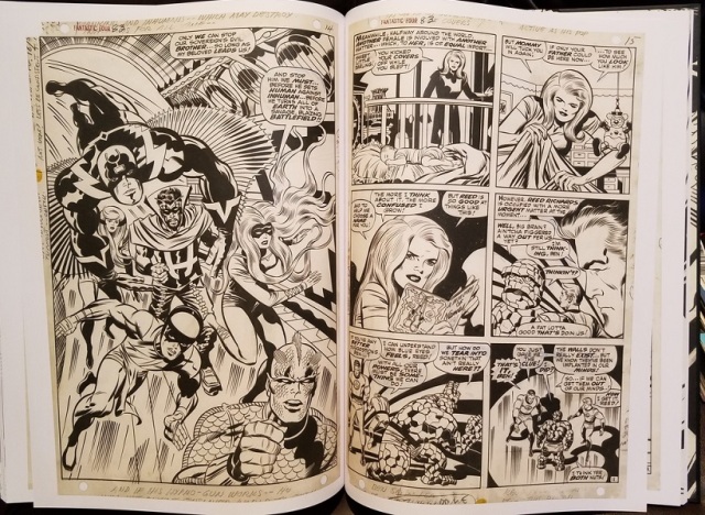
CREDIT: Marvel / IDW

Take a look at the full page splash from FF #83 showing the Inhumans as originally designed by Kirby.  Even better when seen at the full 11″ x 17″ size cradling this massive volume on my lap.   If there is any negative to these at all it is the challenge in finding a place to store these massive books and also in comfortably reading them.  But I wouldn’t have them any other way, I love the presentation of the art at full original size. I’d also like to give a shout-out to designer Serban Cristescu.  There is some really nice spot varnish on the Kirby Krackle on the front cover, as well as on Jack Kirby’s signature and the images of Johnny, Ben and Reed on the back cover.

This edition presents Fantastic Four #s 71, 82, 83, 84, and Annual 6 (with the introduction of Annihilus and the birth of Franklin Richards).  We also get stories with the Inhumans, Doctor Doom, and a handful of additional pages, splashes, and covers that Dunbier was able to round up and toss in as extras in the back of this volume.  At $100, some fans will consider this exorbitantly expensive.  Considering the cost of even a single page of Kirby FF original art, I consider this to be one of the biggest bargains around.  I’m hooked on these volumes, though I must admit to preferring the ones reproducing older art that have the word balloons pasted on to those presenting newer art where the letters are added digitally during production.  Even though I don’t buy them primarily to read the stories, I do appreciate being able to do so as an added benefit.  I cannot afford to get every single volume they put out (I wish I could) but as long as IDW keeps creating them, I’ll keep trying to find a way to set aside the funds to buy as many as I can!

Reviewed by: Bob Bretall
(bob@comicspectrum.com
)
https://comicspectrum.com/ Covering the full spectrum of comics culture

ComicSpectrum ComicBookRoundup  Follow ComicSpectrum: ComicSpectrum Twitter ComicSpectrum FB

Posted in IDW, Marvel | Tagged , , , , , , , | Leave a comment

Nemesis (Marvel/Icon)

51l3gb8ezfl-_sx323_bo1204203200_

CREDIT: Marvel/Icon

Rating: 3/5 – The Art Saves a Story Intended to Shock Me, but Never Did.
By ComicSpectrum senior reviewer Shawn Hoklas.

This past week I didn’t get my normal delivery of comics and even though my backlog of new comics to read is pretty huge, I decided to pull a hardcover off the shelf that may have been sitting there for too long without ever being read. That hardcover was Nemesis, a four issue mini-series by Mark Millar and Steve McNiven. To be honest, I thought that this book was released in 2013 or so, but it turns out that the first issue of this series was released in early 2010 and actually finished in 2010 as well. So the fact that this hardcover had been sitting on my shelf for about six years…well, that tells me I need to visit my shelf a bit more often! We know that Millar has had numerous successful hits in the past like Kick Ass, Chrononauts, and more, so I was expecting a great hook and a lot of fun, things Millar is known for. Unfortunately, only the art really delivered for me in this book that Millar back in 2009 described as, “What if Batman was the Joker?”.

Starting with the good, Steve McNiven’s art is a joy to look at. Throughout the entire four issues, McNiven uses a wide panel layout that extends from each page edge. Occasionally those wide panels are split into two, but for the most part there’s usually only three or four panels to a page. That wider area allows McNiven and Millar to give the book a movie like feel and gives the pencils plenty of room for action, of which there is plenty. Issue three may be McNiven’s strongest issue as Nemesis beats and kills close to one hundred prison guards using nothing but his bare hands and the guards’ batons. McNiven embraces the violence and the blood, which gives the all-white design of Nemesis’ costume even more of an impact since it rarely stays clean. The art delivered on almost every page, while the story rarely did.

Nemesis goes for shock value, twists and turns, but because the pacing of the story is just so fast, I never really cared for any of the characters which made those shocks and twists not really matter to me. The main plot of the story is that Nemesis is out to kill Washington D.C.’s chief of police, at an exact time and date for reasons we’re not really sure of until Millar gives us his backstory that somewhat relates to Batman’s, but has been done much better in the past with DC villains like Prometheus, or even the Wraith from the 1984 Batman Special. That backstory, again because of the rapid pace, is limited and I was never quite sure just how he became this ultra powerful killer. All four issues have Nemesis planning his kill, predicting, much like Batman would, every eventuality and outcome.

Throughout, Millar attempts to shock the reader with just how evil and calculating Nemesis can be, because I cared so little for Nemesis and the chief who he has targeted, I was reading the story mainly for McNiven’s action art. For example; Nemesis at one point kidnaps the chief’s kids and through a single panel with a CNN-like heading, we find out that Nemesis had fertilized the chief’s older daughter’s eggs with his gay son’s sperm while both under anesthetic. It’s shocking for shock value, but having never once seen either of the kids, and having the chief be a very flat character makes it all just seem silly. Also, the ending in its attempt to provide a twist we never saw coming, actually diminished the Nemesis character and made the whole story seem even sillier to me. Overall, except for the art, this was my least favorite Millar work and would be tough for me to recommend. Warner Brothers last year announced that they would be adapting this for film…let’s hope they can turn it into something better.

Reviewed by: Shawn Hoklas
(shawn@comicspectrum.com
)
https://comicspectrum.com/ Covering the full spectrum of comics culture

ComicSpectrum ComicBookRoundup  Follow ComicSpectrum: ComicSpectrum Twitter ComicSpectrum FB

Posted in Icon, Marvel | Tagged , , , , , , | Leave a comment

Legends: 30th Anniversary Edition (DC)

Legends30th

CREDIT: DC Comics

Rating: 4/5 – A 30-year Old Story That Still Resonates Today!
by ComicSpectrum reviewer Al Sparrow.

Why do we read comics?

There’s no all-encompassing answer to this question. We come into this hobby…some would say this way of life…for a number of reasons. For many of us, it’s the collecting aspect: getting a complete run of issues on a title, preserving them in little plastic bags or getting them graded and packed into Mylar sleeves. For others, it’s devotion to a particular creator or character. We may not regularly read a title that Captain Marvel appears in, for example, but we’ll pick that book up if we hear he’s in it, even for just a panel. I like to imagine, though, that if there were a single answer that applied to all of us, it’s this: We read comics to escape.

The world can be a very tough place to live, no matter what advertisements try to tell you. Particularly in this era of social media, and even more so in an election year.  We’re bombarded with news articles, opinion pieces, commentaries, all laden with granules of truth and untruth, and all painting a very dire picture of the world today. Bullying is as prevalent as it has ever been, we’re told we can no longer trust our police, we need a gun just to go to the grocery store, whoever you plan to vote for is the wrong person, we’re going to get killed by that person who looks or acts differently from us…it’s small wonder we look for ways to divert our attention, even for a few minutes, from the chaos in our midst.  It’s in this world that I sat down to read the 30th Anniversary re-release of DC’s Legends crossover event.

I had missed this mini-series when it first came out. I’m not sure if I was turned off by the prospect of having to buy a number of tie-in issues to get the full story – a pretty commonplace practice now, but very new in the mid-80s – or if I was just reading more books with “X” in the title and only had so much allowance money to go around. Or it could be that, coming hot on the heels of Crisis on Infinite Earths and Secret Wars, I was simply burnt out on massive event comics, and was hoping this wouldn’t become a trend.   Hey, I was a nerdy comic reader, not a prophet. Obviously.

The series certainly created a few milestones. The end of the much-maligned Justice League Detroit and the birth of the much-loved Giffen-era Justice League. The reimagining of Task Force X, a.k.a. the Suicide Squad in issue #3.  The emergence of a recently reborn post-crisis Amazonian princess into the public eye. The optimist in me likes to see this book as a celebration of 30 years of excellence birthed by writers John Ostrander and Len Wein, teamed up with artist John Byrne. The cynic in me who spends too much time in that social media circus mentioned earlier knows we’ve got movies coming out about each of those properties, and there’s no moss growing on DC Entertainment’s publishing stone. Still, let’s focus on the positive side of things, if we can.

Reading this title for the first time, I couldn’t help but draw parallels to the current climate of the world we live in. If I’m truly reading comics as an escape, Legends might have been a poor choice, because it has moments of eerily prophetic situations that hit a bit too close to home. Darkseid sends his minion Glorious Godfrey to sow the seeds of fear and discontent among the populace of Earth. Godfrey is almost without peer at his work, a fear monger causing the world at large to distrust the superheroes who protect them, forcing a Presidential order prohibiting superheroes to use their powers, and creating an environment of blind…or maybe not so blind…hatred. Mob mentality becomes the order of the day, and soon Earth becomes a divided planet where you’re either “For Us” or “Against Us”.

Sound a bit familiar? I found this book amazingly prescient. Godfrey knew the right words to use and the right way to present his message (it’s part of his power) to get people to follow him, even obey him. It’s not enough to be afraid of a few superheroes. All superheroes are now suspect. Ostrander and Wein do a good job of showing how lines are divided. Obviously we’re supposed to be rooting for the heroes, but equal time is given to show how people could distrust or even actively hate them. If the book falters anywhere, it’s in the quick-solution ending of having Robin and a number of other children point out the world the adults, led by Godfrey, are leaving them. It’s a little too simplistic, but it works. After all, the things we’re arguing about today are likely going to have repercussions for the next generation, right? Maybe it’s not such a simplistic ending after all.

Some comic book “event” series fail to live up to their acclaim. Changes made by the “shocking, history-altering” cataclysms that occur in their pages often get erased, rebooted, or simply ignored within about a year or two. Legends isn’t much different, where that’s concerned. The JLI is no more (though it has a spiritual successor in Justice League 3001), and the Suicide Squad we have now bears only a titular resemblance to the squad launched in Legends. Still, like Legends, they’ve survived, and if you’ve never read it, it’s interesting to read a story penned 30 years ago that still resonates in the world of today.

Reviewed by: Al Sparrow
(al@comicspectrum.com
)
https://comicspectrum.com/ Covering the full spectrum of comics culture

ComicSpectrum ComicBookRoundup  Follow ComicSpectrum: ComicSpectrum Twitter ComicSpectrum FB

Posted in DC | Tagged , , , , , , , , | Leave a comment

Fade Out Vol. 2 (Image)

TheFadeOut_Vol2-1

CREDIT: Image

Rating: 5/5 – A Fascinating Look at 1940s Hollywood.
By ComicSpectrum senior reviewer Shawn Hoklas.

After a brilliant first volume that introduced us to all the characters and provided us with all the basics needed to move the story forward, volume two takes the story one step further by diving more into the main character’s motivations, providing clues that all is not  as it seems, painting an almost perfect portrayal of late 1940s Hollywood. I was completely lost within the world these two frequently collaborating talents have created and I’m thrilled that there’s still plenty of story left to be told.

In volume one of the Fade Out, screenwriter Charlie Parish woke up next to a famous dead movie star Valeria Sommers. She had been strangled, but he had no recollection of how he got there, who he was with, or whether or not he had a hand in the starlet’s murder. While we get limited insight into main character Charlie Parish’s past, we know he’s a troubled writer who uses his blacklisted writing friend Gil Mason as a ghost writer in order to keep his job, pay Gil, and maintain his status in Hollywood’s unforgiving and competitive scene. Volume two picks up with the down and out alcoholic Gil Mason planning to get back on those that have “destroyed” him while Charlie Parish pursues a relationship with Valeria Sommer’s replacement, Maya Silver.

Brubaker’s writing is perfectly paced as he weaves the story in and out of Charlie and Maya’s blooming romance, Gil’s quest for revenge, and the greater story of just who killed Valeria Sommers. At the end of volume two, I feel as though I’m no closer to knowing just who did it.  Sean Phillips’ art is absolutely stunning in it’s realistic approach and creating a believable cast of characters that I can still picture in my mind the same way I would after watching a live movie. Phillips provides a black and white two-page splash at the beginning of each volume with the cast of characters we’ll read about, and I only needed to look at it once since Phillips is able to give each character their own defined look, even the two blonde movie stars who look similar, but different enough from one another for me to easily tell them apart. All of these characters who Phillips have brought to visual life in the same way a great producer and director select their cast are all intertwined with one another and I’m so engrossed in how all this will eventually play out.

Brubaker has created a cast of characters that all have their inner demons. Fade Out can be depressing at times, but never unreal or unbelievable. The violent scenes are at times cringe worthy in their realistic portrayal, and the treatment of women in this 1940s male dominated industry is at times degrading and sad. It’s never for shock value, but to tell a story that left me feeling a wide range of emotions.  This is comics at their best and something you should definitely give a try.

Reviewed by: Shawn Hoklas
(shawn@comicspectrum.com
)
https://comicspectrum.com/ Covering the full spectrum of comics culture

ComicSpectrum ComicBookRoundup  Follow ComicSpectrum: ComicSpectrum Twitter ComicSpectrum FB

Posted in Image | Tagged , , , , , , , | Leave a comment

The Black Beetle Vol. 1: No Way Out (Dark Horse)

51EoLuHh-mL._SY344_BO1,204,203,200_

CREDIT: Dark Horse

Rating: 5/5 – Francesco Francavilla’s Creator Owned Pulp Hero!
By ComicSpectrum senior reviewer Shawn Hoklas.

Francesco Francavilla is one of my favorite creators currently working. His art style and coloring make me wish we could get more consistent and timely work from him, but whenever I can get his art I always walk away satisfied and feel as though it was worth the wait. The Black Beetle hardcover has been sitting on my shelf for quite some time and since we haven’t gotten any recent Francavilla work in a while, I thought now was the perfect time to read it. It’s absolutely what I expected and wanted, with jaw dropping art and exciting writing we see the Black Beetle investigating a murder in his fictional Colt City.

The Black Beetle was originally created by Francavilla ten years ago in 2006, first being published as a webcomic and then appearing in Dark Horse Presents before finally coming out as a four issue miniseries. Those early appearances in Dark Horse Presents were collected into a zero issue which is also presented in this hardcover collection, before the main mini series titled “No Way Out”. In the zero issue we see a more fantastic adventure than what we get within the main series as a group of black-magic hunting Nazis are trying to find a mysterious artifact called the Hollow Lizard that’s been found and about to be displayed within the Colt City museum. It’s an almost perfect story that introduces us to the hero, his city, and the tone and style of this new world that Francavilla has created.

We’re then treated to the main story which, although less fantastic in scope, is just as exciting as we see Black Beetle investigating a murder and meeting his first villain Labyrinto, another costumed character who wears a faceless maze pattern suit from head to toe. When the Black Beetle learns of a meeting between two major crime bosses, as he goes to confront them in the pub they’re meeting in, it suddenly explodes and both are pronounced dead from the blast. As Black Beetle investigates the main suspect, that suspect is killed as well which leads Beetle on a chase that never lets up until the very end, throwing a couple surprises into the mix that enriched the pulp influenced story.

Throughout the five issues, there are plenty of splash pages and double-page spreads that each could be their own cover. Each page and story is designed is such a way that it feels as though you’re either watching an old movie, or at the very least, looking at an old noir movie poster which relates to the time frame of the story as it takes place in 1941. Francavilla takes that one step further in the production of the book with it’s titles, introductory splash pages and the brilliant lettering found throughout. At the end of the main story we see some nice extras that show Francavilla’s sketches, covers and lobby cards used as promotional materials. It’s a fantastic and complete package that’s worth every penny. Since this original series, the follow up which was announced and titled Necrologue has been delayed since 2013. According to Francavilla’s twitter page, 2016 is the year of the Black Beetle so hopefully we’ll see his return soon, but until then, I’ll be happy to give this collection another read!

Reviewed by: Shawn Hoklas
(shawn@comicspectrum.com
)
https://comicspectrum.com/ Covering the full spectrum of comics culture

ComicSpectrum ComicBookRoundup  Follow ComicSpectrum: ComicSpectrum Twitter ComicSpectrum FB

Posted in Dark Horse | Tagged , , , , , , | Leave a comment

The Envelope Manufacturer (Drawn & Quarterly)

Screen Shot 2016-02-22 at 7.41.24 AM

CREDIT: Drawn & Quarterly

Rating: 3.5/5 – A Thought-Provoking But Challenging Story.
By ComicSpectrum senior reviewer Shawn Hoklas.

Over twenty-five years ago, Chris Oliveros created a publishing company called Drawn and Quarterly. Back then it published a lone anthology magazine by the same name before branching out into more long form comics and graphic novels. Over the course of almost three decades, Drawn and Quarterly has published works by Chester Brown, Daniel Clowes, Chris Ware and more. Chris Oliveros was there for it all, until last year when he stepped away as publisher to focus in on his own project and the first is titled ‘The Envelope Manufacturer’.

Although originally deciding to self publish the first couple issues, a couple of setbacks delayed subsequent releases and Oliveros re-worked the book and decided to publish the story as a graphic novel with the company he founded so many years ago. The Envelope Manufacturer isn’t a joyous read, but it’s thought provoking and a challenging work as you decide just what’s real, and what may be the main character’s stressed and breaking mind. Mr. Cluthers owns a struggling envelope manufacturing facility that’s struggling to get by with out of date equipment, a staff of two, debt collectors calling incessantly and to top it all off, Cluthers has a wife who has had enough. Cluthers continues to believe that he’s on the verge of a break with more orders coming in, which he constantly reminds himself and his staff of, but they never do.

Adding to the weight of the struggling business, there’s also a fascination with suicide. It’s here that the book challenged me as I tried to understand just what Cluthers is seeing or thinking. In a particular scene, Cluthers is walking down the street while off panel, someone is yelling to ‘Jump’ off a building we never completely see. This theme carries throughout the book and is handled in different ways by Cluthers and also one of his staff, Herschel. There are also scenes where the art we’re shown has caption boxes pointing to someone off page, giving us a feeling of not being in control, much like the characters Oliveros is presenting to us. I think the story will challenge you, like it did with me, but it’s intentional and accomplishes the feelings the work is trying to evoke. That challenge may frustrate some readers as it did with me at times, but that is also what makes this book unique.

What made me pick this book up was the cover art. I love Oliveros’ style. Lots of short lines defining shadows and textures make up a majority of the art. The interiors are black and white which makes the blacks all that more defining. Looking at Oliveros’ machinery, you realize just how simple his art is, yet it has a complex and heavy feel to it. The machinery is old with cranks, buttons and knobs, but Oliveros uses simple shapes with lines and dashes to give it all a weighted mechanical feel. He uses six-panel pages for most of the square shaped book and zooms the camera in, again, giving an unclear picture at times of just what’s happening in the scene, also providing a skewed perspective. It mostly works, but it’s not easy and I could say that ultimately it’s somewhat rewarding. It’s exciting to see Oliveros’ first work, and because of his appealing style, I’m eager to see what he has in store next.

Reviewed by: Shawn Hoklas
(shawn@comicspectrum.com
)
https://comicspectrum.com/ Covering the full spectrum of comics culture

ComicSpectrum ComicBookRoundup  Follow ComicSpectrum: ComicSpectrum Twitter ComicSpectrum FB

Posted in Drawn&Quarterly | Tagged , , , , | Leave a comment

Swords of Sorrow: The Complete Saga (Dynamite)

Swords

CREDIT: Dynamite

Review: 3.5/5 – A Nice, if Disjointed, Piece of Comics History
by ComicSpectrum reviewer Al Sparrow

While the rest of the world was busy getting caught up in Secret Wars and Convergences, there was another epic crossover I had my eyes on. Dynamite has made a name for itself over the past few years as a home to a number of those elusive “strong female characters” so many industry people seem to want to tap into, but don’t always seem to get right. Let’s be honest, when you’re dealing with characters like Dejah Thoris, Red Sonja, Jana the Jungle Girl, and Vampirella – all characters who seem to have an ongoing bet as to who can show up in less clothing – you could be forgiven for dismissing this series as a giant slice of cheesecake. Particularly when you have artists like J. Scott Campbell (on cover detail for the first issue), Francesco Manna, Dave Acosta, and Mirka Andolfo covering the art chores. Yes, if that were all there was to this series, you’d be well within your rights to just roll your eyes and give this series a pass.

That’d be a big mistake, of course, because the series also offers one of the strongest all-female writing squads ever assembled: Gail Simone at the helm, overseeing the main storyline, Nancy Collins teaming up Vampirella with Jennifer Blood, Marguerite Bennett on a Red Sonja/Jungle Girl three-parter, and G. Willow Wilson and Erica Schultz on a Masquerade/Kato one-shot. And that’s just getting the list started. While it is neat to have an all-female group writing this series, it isn’t because they’re great female writers, but because they’re great writers – period – that these characters, whether legends from classic science fiction or relatively recent creations from comics’ “Bad Girls” movement, are given the opportunity to show who they are now as opposed to how they may have been viewed in the past.

The individual books are collected based on when they were released, and while that makes sense on one level, on another it makes for a fairly confusing read. Individually each story, from the one-shots to the multi-parters to the overarching main book, offer a lot of fun, exciting adventure with great artwork riding shotgun. Putting all those pieces together in a more coherent order might have been worth the effort.  When the book winds towards its ultimate conclusion it’s also tasked with concluding some of those side-stories, which yanked out of the overall tale.

So, is the story itself any good? That ultimately depends on what you’re looking for. In the forward Simone talks about this history of this series – the opportunity to bring all these characters together in the same book for the first time – and she’s right. If you’ve ever wondered what might happen if Miss Fury teamed up with Lady Rawhide, or if the Green Hornet’s Black Beauty wound up on Mars, this is your book. The story itself is almost irrelevant in the face of its cast of characters. It’s a pretty standard bad guy wants to take over the world and a ragtag band of people are gathered together to try and stop him. There’s a few twists and turns along the way, but this is a story you’ve seen before…albeit not one with Pantha and Lady Greystoke in it, but similar nonetheless.

When this series was announced I knew I wanted in. I knew I’d be getting great artwork and, as I mentioned earlier, some of the industry’s best writers pulling the story together. I also knew it was a Dynamite book, so I knew there’s be tons of variant covers (thankfully put together in a nice gallery at the end of the book) and there’d eventually be a massive trade of it, so I felt like waiting to see how everything fell together before commenting. While the story of Swords of Sorrow isn’t necessarily anything I haven’t seen before, it’s a nice little chronicle of characters both old and new, gathered together to tell that story. It tends to skip around a lot due to the stories being packed in order of release, but if you know that going in, it shouldn’t distract too much from your overall enjoyment of the story.

Reviewed by: Al Sparrow
(al@comicspectrum.com
)
https://comicspectrum.com/ Covering the full spectrum of comics culture

ComicSpectrum ComicBookRoundup  Follow ComicSpectrum: ComicSpectrum Twitter ComicSpectrum FB

Posted in Dynamite | Tagged , , , , , , , , , , | Leave a comment

Blast Furnace: Recreational Thief

BlastFurnace

CREDIT: Ryan Browne

Review: 5/5 – An Experiment in Ridiculousness Pays Off for the Creator of God Hates Astronauts
by ComicSpectrum reviewer Al Sparrow

Fans and participants of 24-Hour Comic Book Day, take note. Ryan Browne has just upped the ante. In what can perhaps be called a bold yet foolhardy experiment, Browne set out to create a story with the following restrictions: He could only spend one hour on each page with zero planning ahead of time. Basically he sat down at his art desk and simply began scribbling and stopped when the clock hit 60 minutes later. Then he did another page. Then another. 280 pages later, he’d created Blast Furnace, which might be the most awkwardly plotted, crazily drawn thing I’ve ever read.

At the same time, it might be the best thing I’ve read in years.

While poring over each hastily-drawn page, as the story itself got more and more ridiculous – he had me at an ostrich wanting to watch porn on pay-per-view while being put up in a cheap motel – the grin on my face kept getting bigger and bigger. This was the comic my 13-year old id most likely would have written. Unencumbered by things like continuity, stereotypes, or an excessive need for technology to clean things up, this book takes an adult reader’s mind to places it probably hasn’t been in years. It’s a sloppy mess that’s all over the place, and at the same time it’s a beautiful throwback to why we read these funnybooks in the first place.

I can’t explain the plot. I don’t even believe Browne can explain it. It’s a stream-of-consciousness trip that should give many artists pause to wonder what possible excuse they can put up against not completing their own works. In the equivalent of roughly 11 days, Browne created a complete graphic novel (barring extra time for coloring and publishing it). What’s holding everyone else back? What’s holding you back, if you have it in you to create and tell your own story?

Of course the book will not be for everyone. Many will find it to be juvenile, incoherent, and without any sort of structure. Anyone able to get beyond those hurdles, however, will see this book for what it really is: A love-letter to anyone who ever put a ballpoint pen down on a piece of notebook paper back in school and tried to make something with it. If you’re one of those people, seek this book out. The Kickstarter edition I backed (getting in on the $25 early-bird special) included a random sketch (and I do mean random!) on the first page as well as a poster, postcard, and sticker. Without all those extras, it was still worth picking up.

Reviewed by: Al Sparrow
(al@comicspectrum.com
)
https://comicspectrum.com/ Covering the full spectrum of comics culture

ComicSpectrum ComicBookRoundup  Follow ComicSpectrum: ComicSpectrum Twitter ComicSpectrum FB

Posted in self-published | Tagged , , , , , , | Leave a comment

The Milkman Murders (Image)

31cxqJ1cJpL._SX327_BO1,204,203,200_

CREDIT: Image

RATING: 4/5 – A Dark and Disturbing Look Inside a Suburban Home.
By ComicSpectrum senior reviewer Shawn Hoklas.

Back in 2004, Dark Horse published a four issue mini series as part of their horror line called The Milkman Murders. Written by Man of Action’s Joe Casey with art by Steve Parkhouse. The Milkman Murders is a disturbing look at the potential horrors of suburban life. Although originally published by Dark Horse more than ten years ago, a few years back Casey and Parkhouse brought their creation over to Image Comics to be released in a hardcover edition. Since I missed getting my shipment of comics this week due to the New Year, I pulled this off of the bookshelf and I’m both glad, but also a bit depressed that I did. The Milkman Murders takes you to the dark shadows of suburban life and within the confines of one suburban home, shows multiple acts of violence, depravity and abuse.

What’s even more unsettling about this book is that all the acts of violence are shown with Parkhouse’s slightly cartoony style. Parkhouse has a heavier line and none of his characters are pretty to look at which makes the horrible acts we see throughout all that much darker. He’s able to convey emotions on his character’s faces and uses his cartoony style to express emotions. There’s a particular scene where the mom, who acts as the main character in the book, loses her patience and screams at her son. Her face contorts dramatically and unrealistically while her teeth are enlarged to a point where she looks like a monster, but Parkhouse is able to make you believe it. Parkhouse also makes all the scenes with the family members dark and dirty, but when he shows suburban life outside of their house, everything is clean and polished. The houses are well manicured, the “Mass-Mart” is pristine, and there’s the image of a perfect world presented on the television shows watched by the mom each day.

The Milkman Murders isn’t pretty from an artistic view, or from it’s story. There’s quite a bit to be disturbed by including animal cruelty, domestic abuse and rape. So those who may be a bit more squeamish may want to stay away from this book, but if you can handle the material for what it is, Casey tells an engaging story despite the depressing content. Although at times each of the characters can come off as stereotypical and purposefully so, the way their lives are portrayed and the way the mom interacts with each hooked me until the very end. As dark as the story begins, about halfway through the book it takes and even darker tone and truly turns into a horror story. The Milkman Murders is a book that explores just how dark and dirty lives in a clean suburban world can be. Casey and Parkhouse created a home in a suburban town I’d never want to visit, but after reading this I’m glad I did.

Reviewed by: Shawn Hoklas
(shawn@comicspectrum.com
)
https://comicspectrum.com/ Covering the full spectrum of comics culture

ComicSpectrum ComicBookRoundup  Follow ComicSpectrum: ComicSpectrum Twitter ComicSpectrum FB

Posted in Dark Horse, Image | Tagged , , , , , , , | Leave a comment

Aliens: Salvation (Dark Horse)

27253

CREDIT: Dark Horse

Rating: 5/5 – Re-Releasing This Gibbons/Mignola/Nowlan Classic After Twenty Years!
By ComicSpectrum senior reviewer Shawn Hoklas.

I may have missed Aliens: Salvation the first time around, but I can’t remember for sure. This one-shot was originally released back in 1993 and since I can’t remember everything I read since there’s just so much to read, it felt as though this was the first time I’ve ever seen it! Written by Dave Gibbons with art and inks by Mike Mignola and Kevin Nowlan, Salvation boasts some of the industries best talent working on a franchise that’s beloved by so many, and they absolutely deliver in all categories.

The Space Freighter Nova Maru is on a mission to deliver it’s payload to a planet that’s completely covered by water, except for one lone, large island. After an emergency on the ship that occurs within the story’s first few pages, the deranged Captain Foss and main character/cook Selkirk abandon the ship, crashing into the sea close to the planet’s land mass. The rest of the story is told through the perspective of Selkirk, who’s a deeply religious character who thanks and prays to God after every life saving event or dangerous situation, which there are many. How the Aliens show up is something we’ve seen before, but considering that this was written over twenty years ago it was most likely a bit more fresh at the time. Dave Gibbons makes Selkirk believable, and puts him through a series of events that would question anyone’s faith. This story reads so well and although this is a hardcover, it’s easily read in one sitting since you won’t be able to put it down.

Mike Mignola’s art is of course beautiful. I was surprised to see his pencils in a science fiction setting at first, but that quickly changes when the Captain and Selkirk arrive on the jungle infested island. Mignola’s rendering of the Aliens is frightening and because of his style, he’s able to limit the amount of lines in order to bring out all the details of the Alien’s distinct features. Their ridged skin, muscular frames and black shiny skin are all perfectly portrayed with Mignola’s pencils, and Kevin Nowlan’s inks never overshadow the work.

Although rarely celebrated, the lettering by Clem Robins was also something that I noticed in a good way. He uses all sorts of techniques to differentiate the dialogue and tones. Light and dark bolds, slight differences in the heights of the letters and just the right size of sound effects made this a pleasure to read not only for its story, but also for my eyes. Alien: Salvation delivers in every category and should be something that appeals to Alien and non-Alien fans alike. These are some of comic’s best creators producing work during their creative peaks. Don’t wait another twenty years before reading this for the first time!

Reviewed by: Shawn Hoklas
(shawn@comicspectrum.com
)
https://comicspectrum.com/ Covering the full spectrum of comics culture

ComicSpectrum ComicBookRoundup  Follow ComicSpectrum: ComicSpectrum Twitter ComicSpectrum FB

Posted in Dark Horse | Tagged , , , , , , , , , | Leave a comment